
PROBLEM STATEMENT
The brand's existing identity did not evoke the sense of trust & friendliness the brand needed to attract & engage with its audiences.
DESIGN SOLUTION
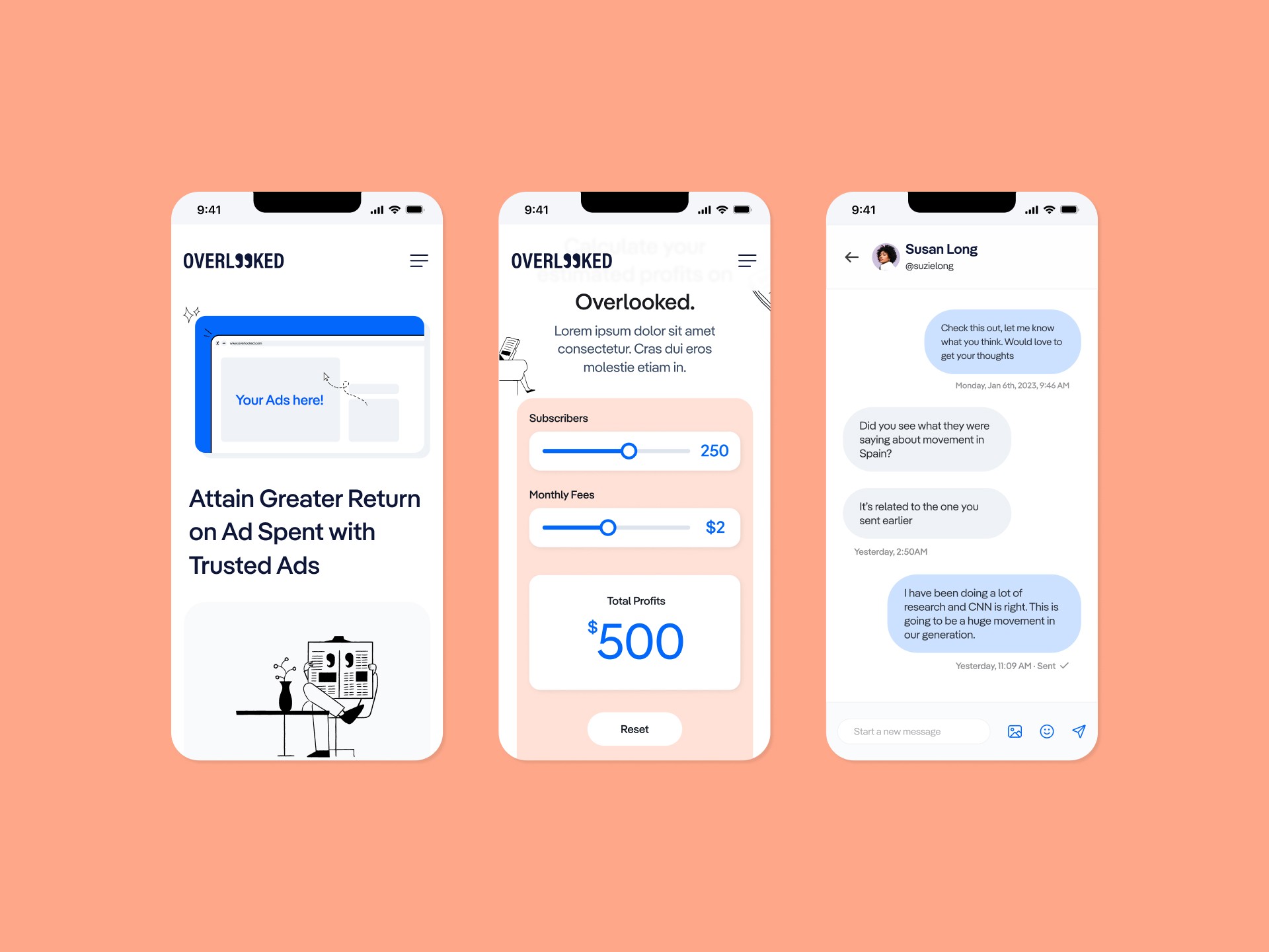
Refresh their existing brand identity to establish a more cohesive brand system that connects well with their audiences while effectively communicating the brand's objectives & ethos.
AUDIENCE ANALYSIS
Millennials & GenZs
Aged 18 to 35
Frequently consumes news through social media.
TONE OF VOICE
Balanced
Fun & Communal
Confident & Trustworthy
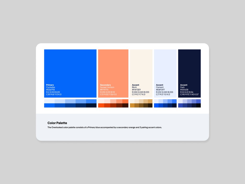
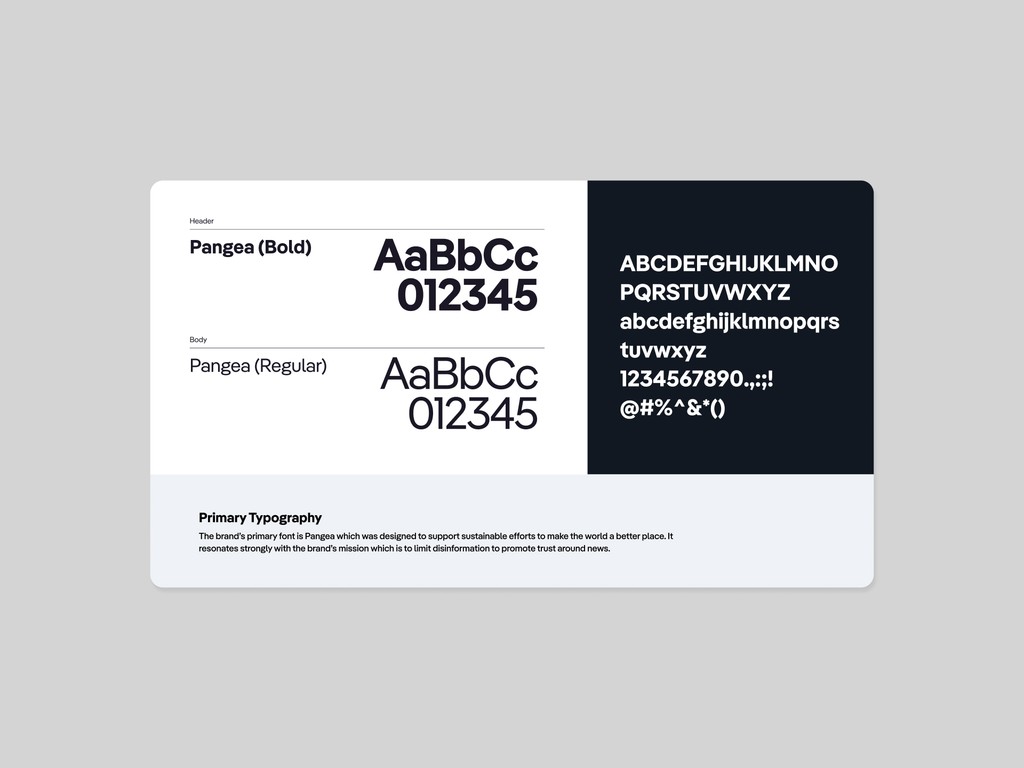
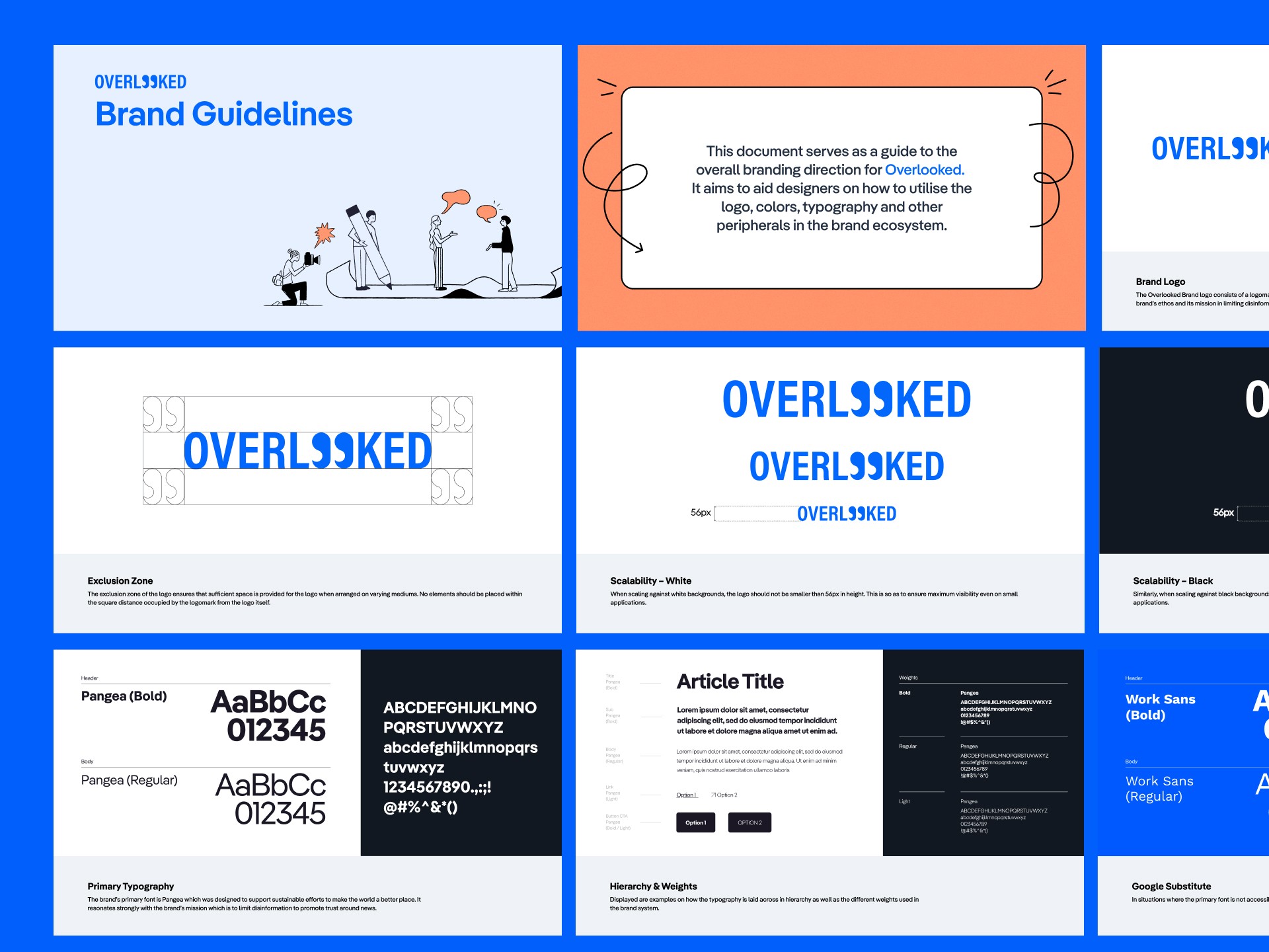
COLOR PALETTE & TYPOGRAPHY
In terms of the brand story, Overlooked is focused on combating fake news for the greater good of journalism & society.
With that in mind, the typeface Pangea was selected as the main typeface. Pangea was developed to combat global warming by donating a portion of its sales to reforestation efforts. Albeit towards a different cause, both the brand & font shared a similar end goal which was to help society as a whole.
The client wanted to bring forth their heritage within the branding to remind them of their history & motivations. The palette therefore draws references from the surroundings of Greece with each shade adjusted to be more saturated to communicate the web3 aspect more evidently.
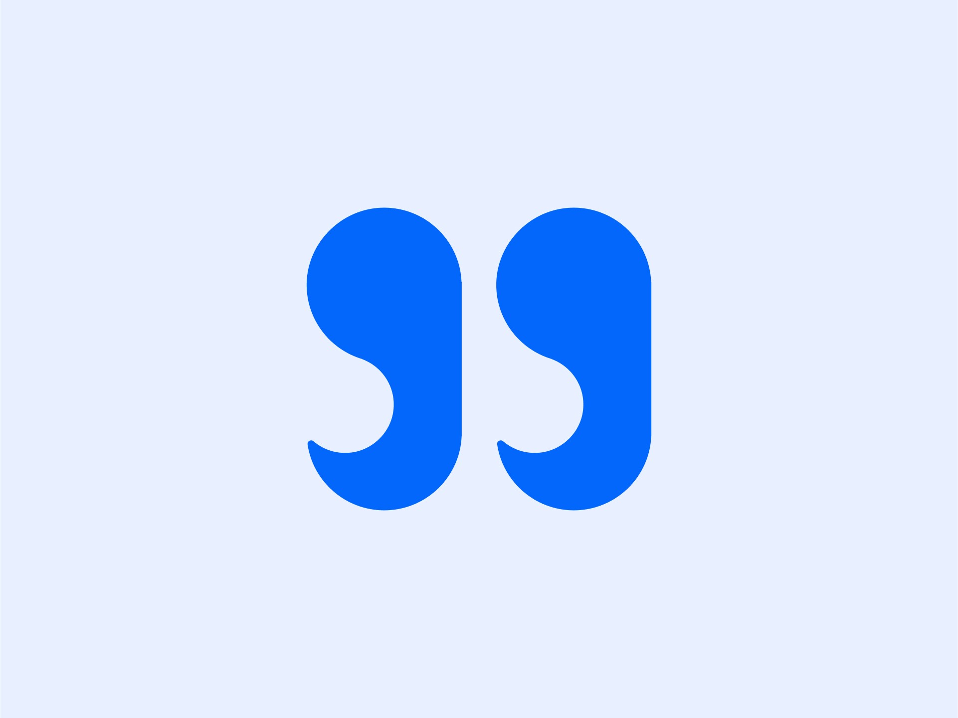
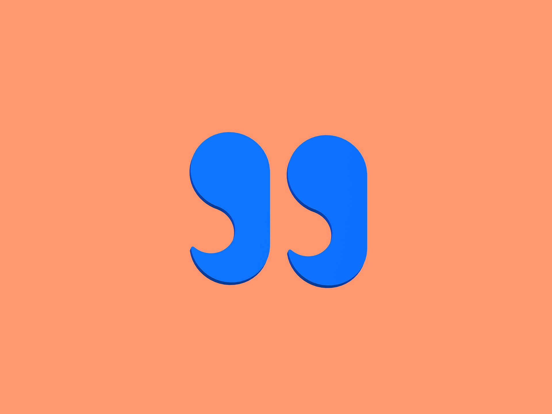
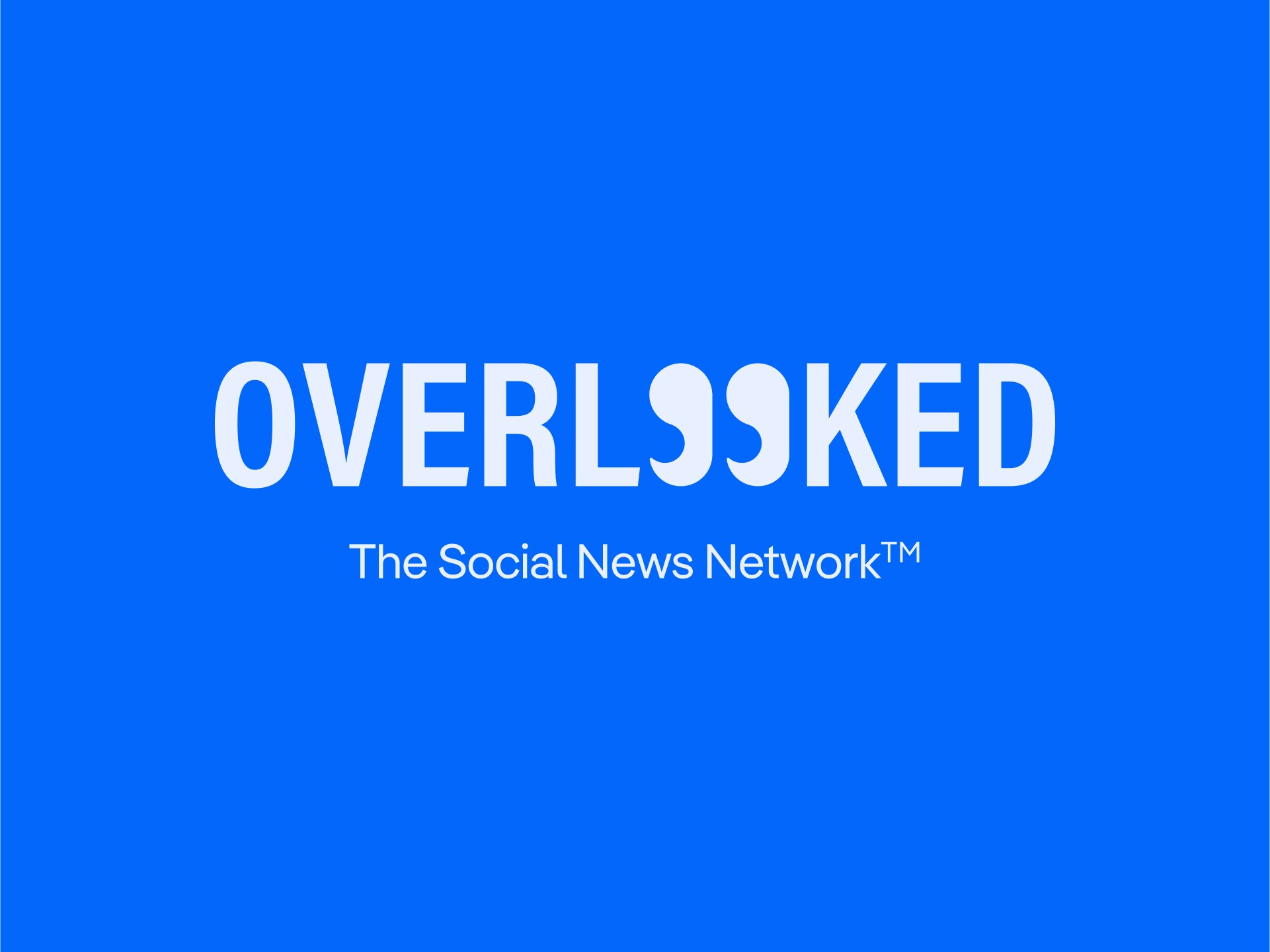
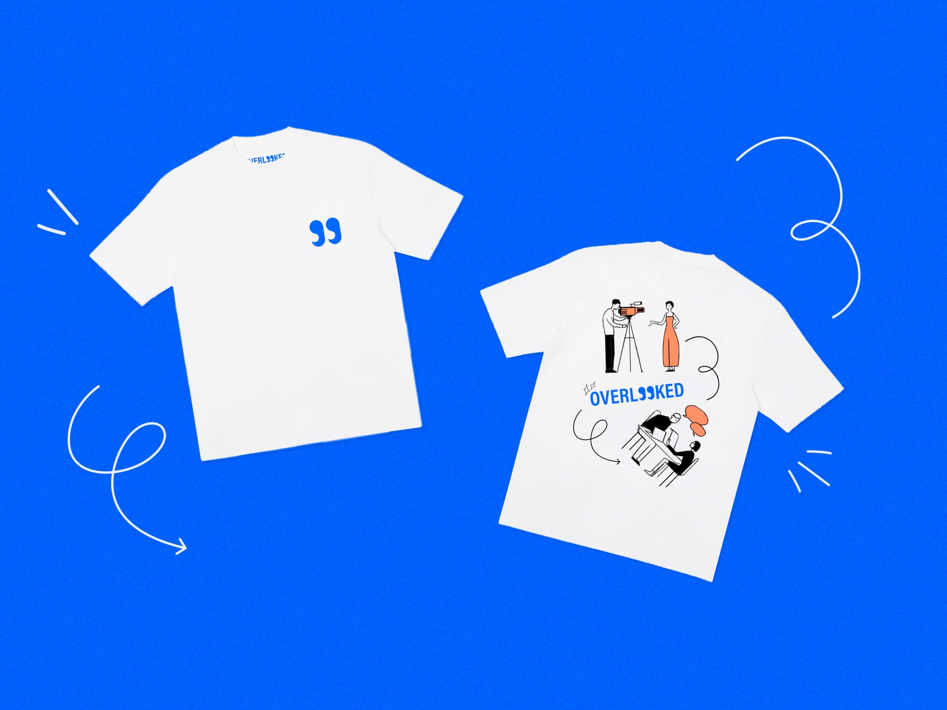
LOGOMARK
The meaning behind the name Overlooked is to look at things from the bigger perspective to reduce the misrepresentation of information.
To complement the brand story, the Eyes first came to mind as a symbol represent the act of seeing with clarity. It seeks to promote transparency.
The Quotation Marks were then thought of to represent the act of conversations & news.
Together, they represent Overlooked, a platform for trusted news & conversations.
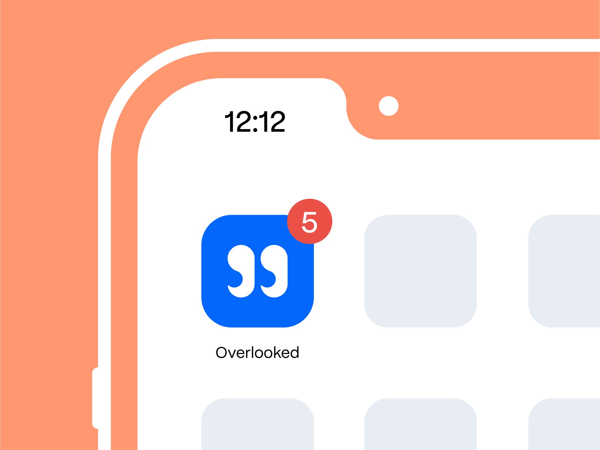
BRAND IDENTITY
The refreshed Overlooked identity brings forth a balance between trust & playfulness that encourages users to engage with & consume.

RESULTS
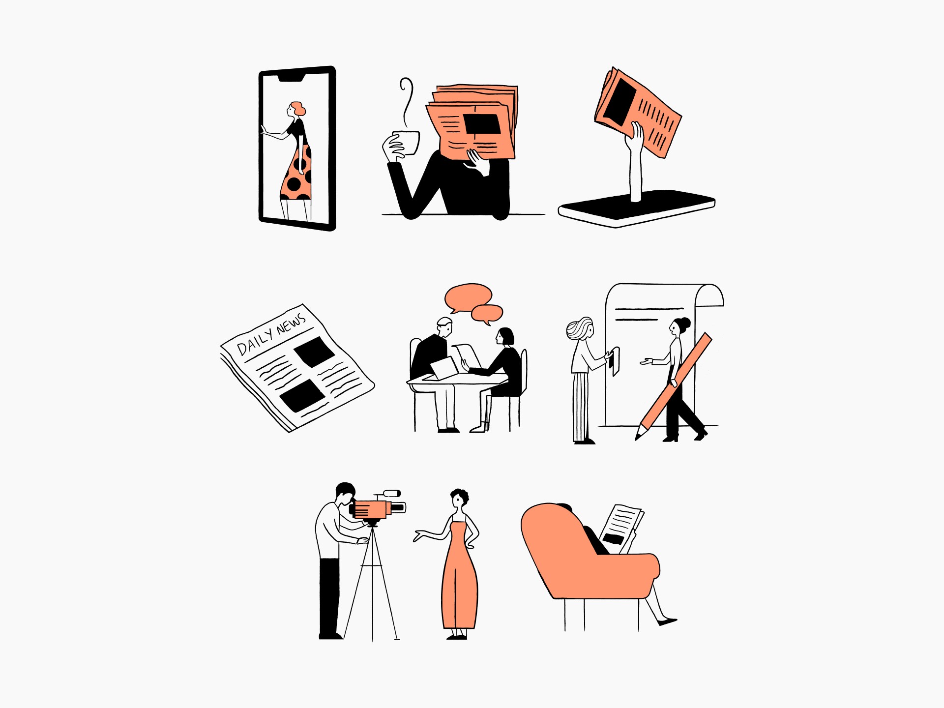
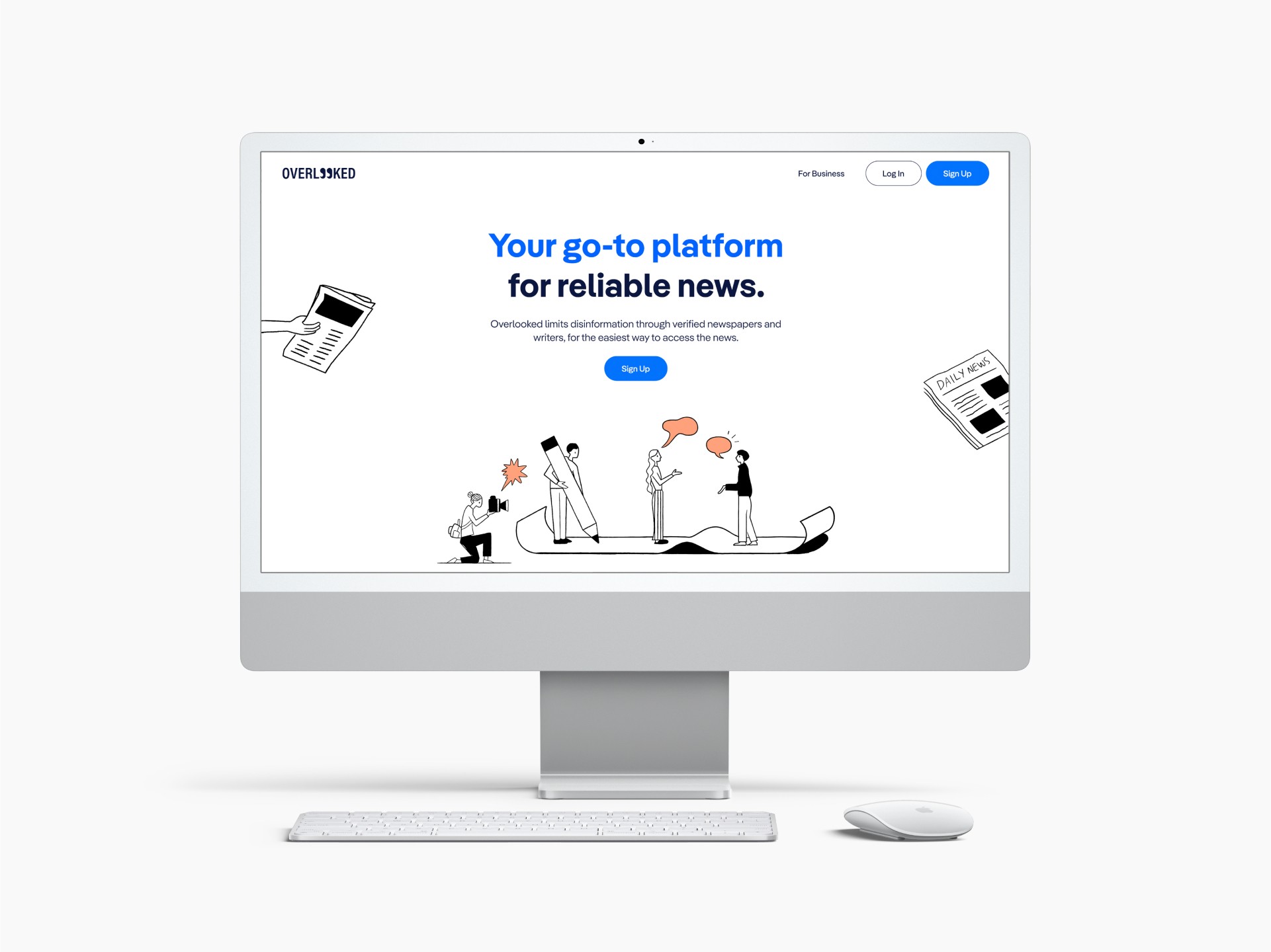
While at that time, the product was still a work in progress, the clients were very satisfied with the rebrand & design peripherals (marketing collaterals, landing page design, pitch deck, icons & illustrations). They felt that it communicated their goals & vision for the brand effectively.
CHALLENGES
At the beginning, there was no clear tone of voice that the client wanted the brand to take on.
SOLUTIONS
I spent more time on moodboarding & sketching to align better in terms of the direction before any high-level design execution to reduce back-and-forths & design hours.
KEY LEARNINGS
The logo helps to communicate the brand's story. It is therefore important that it upholds meaning relating back to what the brand stands for & the problem it seeks to address.